

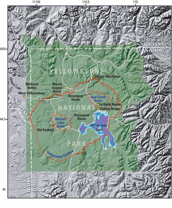
If you take a look at the unfiltered plot of the continued uplift of the Sour Creek Dome here... (third graph down) you can see for the very last section a new line emerging. The most recent "cloud" of data points are marked in red. See the highest one? If you look to it's left you can see a trail of points going back into the main data set.
The Sour Creek Dome is quite a large area... and by the amount of data points appearing with each update it's obvious they are sampling at more than one location. But from the graph it looks like that one datum point on the dome has very recently broken out of the trend, risen above the background noise, and is uplifting much quicker than the rest of the dome.
I think someone should perhaps home in on this single datum point and "cast a net" around it so we can see what's happening with greater resolution. More pixels if you like. It looks to me like most of the dome is slowing perhaps with just a single point continuing the trend of the past few years. Either way, more resolution please? Has anyone go a link that plots these datum points on the dome with separate graphs for each one?

1 comment:
The last event recorded by U of U and USGS is a 2.6 located on Sour Cr Dome...
Post a Comment